Adopting a “Don't Make Me Think” Design Philosophy
User Experience (UX) design and User Interface (UI) design are both complex and multi-faceted software design disciplines. For those just starting out in their design career, or those who only wear these hats part-time, these disciplines can sometimes feel overwhelming. For a lot of small to midsize companies, having dedicated UX/UI professionals just isn't feasible.
This doesn't, however, mean your organization can't develop engaging, easy to use, and aesthetically pleasing designs. I believe that anyone can significantly improve their design chops by keeping one simple end-user mantra in mind when they design just about anything:
Don't make me think!
The Book
Let me back up a step. One of my favorite user experience books of all time is Steve Krug's classic "Don't Make Me Think".
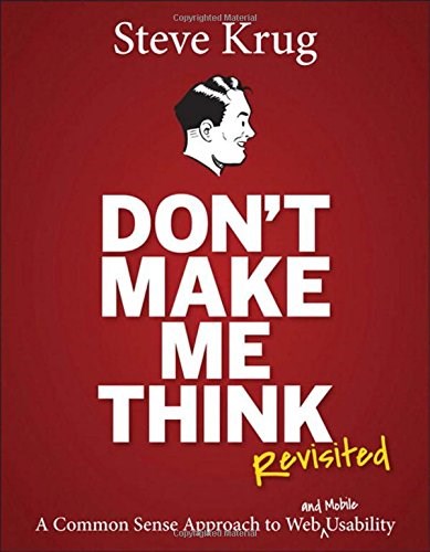
I first discovered this book when it was in its second edition back in 2007. It was around this time that I really began to dig into the whys and hows of effective user interface design.
It is a relatively short book that is packed full of easy to understand and very valuable insights. At times it may feel a bit dated, but its principles go deeper than current design trends to the core of design: understanding how users interact with your product.
The “don’t make me think” philosophy is geared towards UI/UX design but its principles (as we’ll see below) can be applied to any design oriented discipline.
The Application
It's all about asking questions. Then answering them.
The trick though is what you do with the answers. You answer each question by improving your design to address the questions before they even arise for the end user. You are looking to make the thing you are designing self-evident. I know that not everything can be completely self-evident. But that is the idea.
Remove as many barriers to understanding as possible by iterating through this question and answer process until you've addressed all of the questions in one form or another.
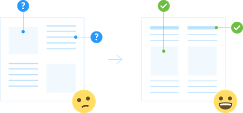
Consider also that better designs work to minimize cognitive load. That is, the more effort involved in understanding your design, the less usable your design is. By reducing cognitive load, the user has more patience for the unplanned hiccups they may experience with your design. And the unexpected always comes up (Murphy’s Law), so consider this in your design by putting in the work to make it easy to understand.
Let's look at a few examples of how this iterative question and answer approach to design can work in practice.
The Examples
Business Card Design
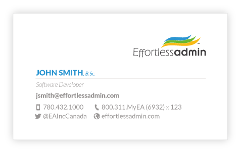
First, let’s look at an example of how we used this approach to improve our business card designs. This is the card we started with:
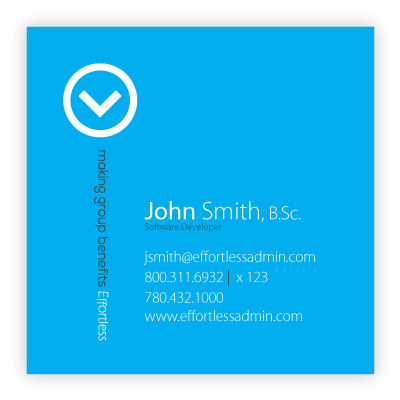
What questions might arise when a prospect receives this card, or goes to use the information on the card?
- Where do I put this?
It's an odd shape and doesn't fit my wallet or card holder. The risk here is the card may be lost or tossed. - Where can I write on this card?
I want to write some information on the card about the person who gave it to me. - Which phone number do I use to contact his person?
There are multiple numbers that have similar priority. - What company is this for again?
I need to check both sides of the card to get a complete picture.
After asking then answering these questions, we came up with this new design:
- Where do I put this?
We sacrificed a unique square card size for a standard card size that will work with any card organizing system the recipient may have in place. - Where can I write on this card?
We added white-space to the card to make room for the recipient to take notes on the card. And, we made sure the white-space was actually white. - Which phone number do I use to contact this person?
We clearly identified the purpose of the various phone numbers. - What company is this for again?
Branding was placed on both sides of the card.
Let's look at another example.
Software Design
Next up is an example of how we used this approach to improve the input of basic personal information. In order to customize the experience of the system for users we (optionally) ask users for a preferred name.
Here is the user interface we started with:
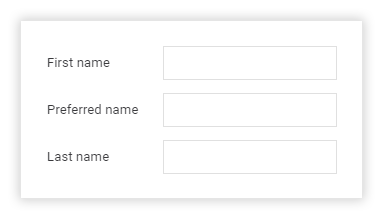
What questions might arise when a user encounters this interface and attempts to enter their name? Here are a few issues we discovered:
- What is a preferred name?
- Why are you asking me for a preferred name?
- Is providing a preferred name required? What if I don’t have one?
- Could users accidentally enter their last name in the preferred name field?
After asking then answering these questions, we came up with the following iteration in our design:
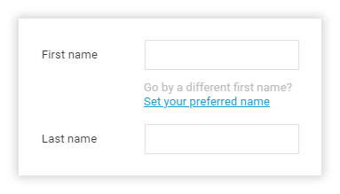
- What is a preferred name?
We clarified what a preferred name is through more descriptive text. - Why are you asking me for a preferred name?
By clarifying what a preferred name is we also implicitly answered this question. - Is providing a preferred name required?
The process for setting a preferred name was made obviously optional. - Could users accidentally enter their last name in the preferred name field?
By forcing the user to intentionally choose to enter a preferred name we removed the risk of accidentally entering their last name in this field.
The Challenge
Try using this simple “Don’t Make Me Think” approach on your next design project. Once you think you've arrived at the right solution, set it aside for a while before coming back to it and intentionally working it through with fresh eyes looking for questions that your end user might have. Then work to answer those questions through the design itself.
Keep each prior iteration around to see how your designs improve as you iterate through this process and apply it over time.
In this article we considered how users actually use something, and how to use this knowledge to improve our designs. The other side of the equation relates to aesthetics or how the user perceives something. We'll consider the impact of aesthetics on user experience in a future article. Stay tuned.